
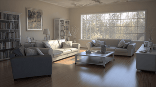
Let’s be honest—choosing wall art can feel like a high-stakes decision. One wrong piece and suddenly your cozy living room is giving "dorm room chaos" instead of "grown-up sanctuary." But here’s the secret weapon most people overlook: color matching your wall art to your space. Not only does it elevate your room instantly, but it also ties everything together like a well-thought-out outfit. (Yes, your walls deserve a wardrobe too!)
Now, we’re not saying everything needs to be the exact same shade of beige. That’s how you accidentally turn your living room into a waiting room. What we are saying is that a little intentionality with color can work wonders. When your wall art picks up on the hues already living in your room—like that soft blue in your throw pillows or the terracotta in your rug—it creates this beautiful, effortless flow. Suddenly your space feels cohesive, polished, and yep—totally Pinterest-worthy.

Wall art is one of the easiest (and most fun) ways to bring color into a room. Want to liven up a neutral space? Choose a bold abstract with pops of mustard, teal, or coral. Craving calm vibes in your bedroom? Go for nature-inspired prints with soft greens, muted browns, or dreamy blues. It’s like setting the emotional tone of the room with just one frame.
And let’s not forget: wall art doesn’t have to match your space perfectly—it just has to talk to it. A little echo here, a hint there. Maybe your artwork has a splash of gold that winks at your brass lamp. Or a soft blush tone that mirrors the flowers on your coffee table. It’s those subtle connections that create harmony.
Here’s a pro tip: use the 60-30-10 rule with your color scheme. That’s 60% of your main room color (think walls or big furniture), 30% a secondary color (like curtains or rugs), and 10% an accent—this is where your wall art can shine. Pick artwork that pulls from your accent shade to really make the space pop.
Don’t be afraid to mix styles either! A gallery wall with a mix of photography, bold prints, and minimal line art can still feel totally cohesive when the color palette is consistent. It's like a well-curated playlist—you can have variety, but the vibe stays strong.
So next time you’re debating between that neutral abstract or the bright botanical print, don’t just think “What do I like?” Think “What belongs here?” Matching your wall art to your space isn’t about playing it safe—it’s about making everything sing in the same key.
Because when your art and your room are speaking the same language, your whole space feels more intentional, more inviting, and a whole lot more you.